Creating a chart in Excel allows you to visualise your data and make more sense of it.
Here’s how to create a chart.
- Highlight the required data
- Select ‘Insert’ to choose either a chosen chart, or a chart type recommended by Excel
- Insert the chart
- Add titles, axis labels and colours for professionalism
Excel offers many different forms of charts from simple bar charts to surface charts, there is always one to display your data.
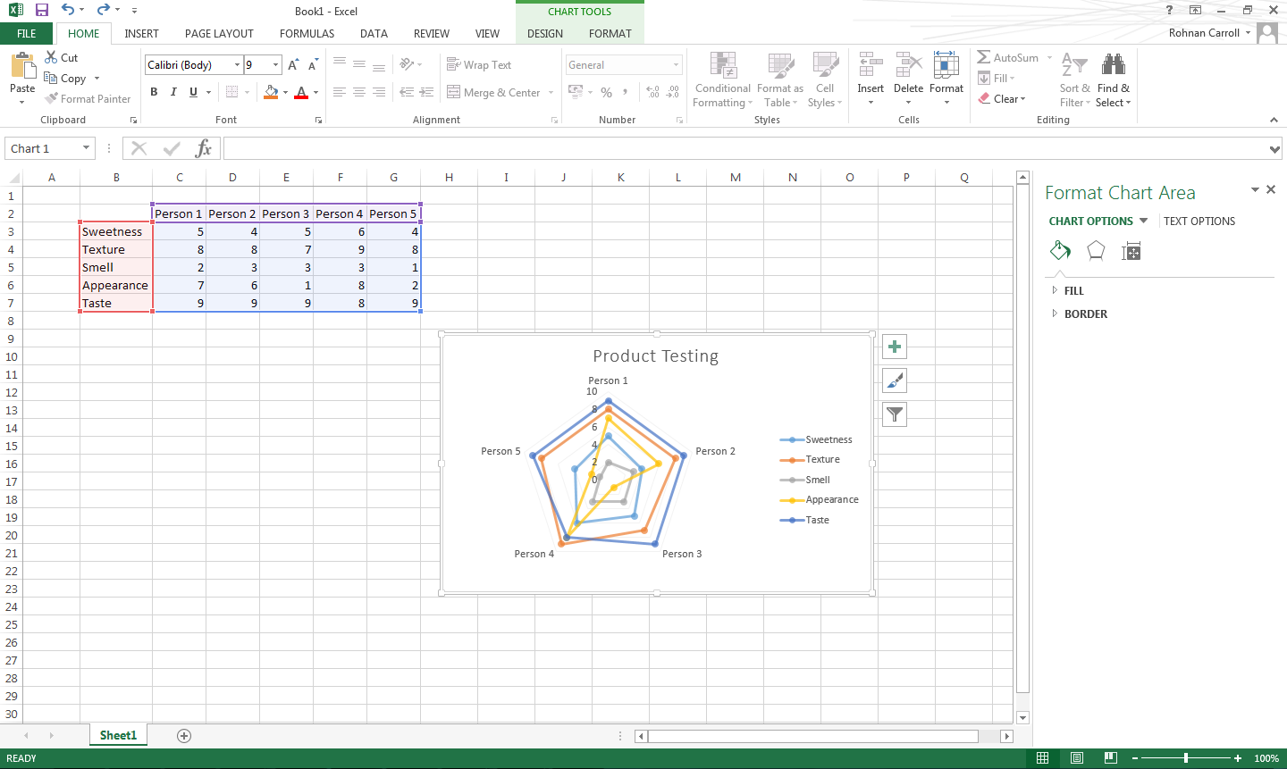
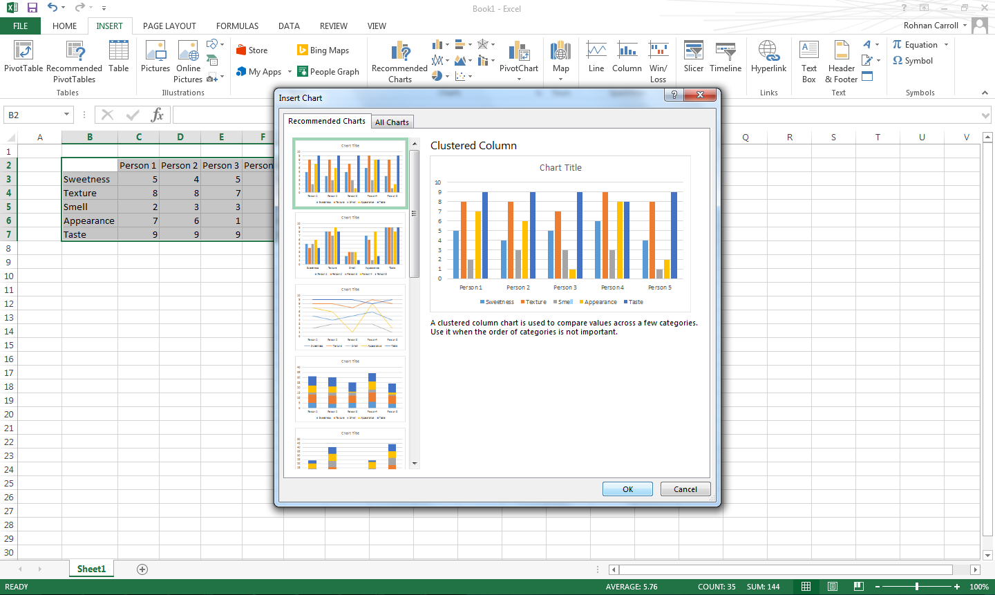
Below is a set of data which shows 5 people rating a food product.
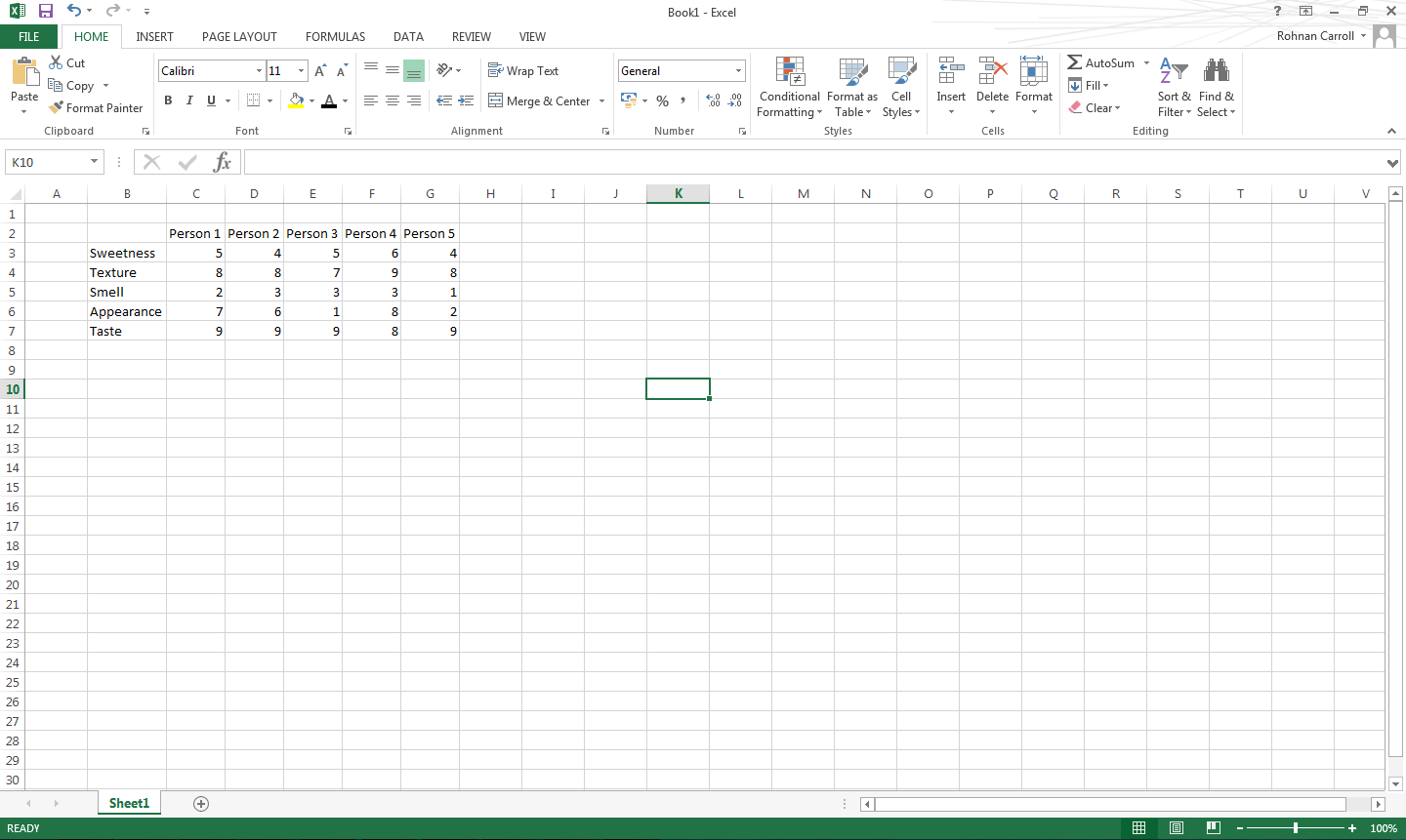
To put this data into a chart you would highlight it. 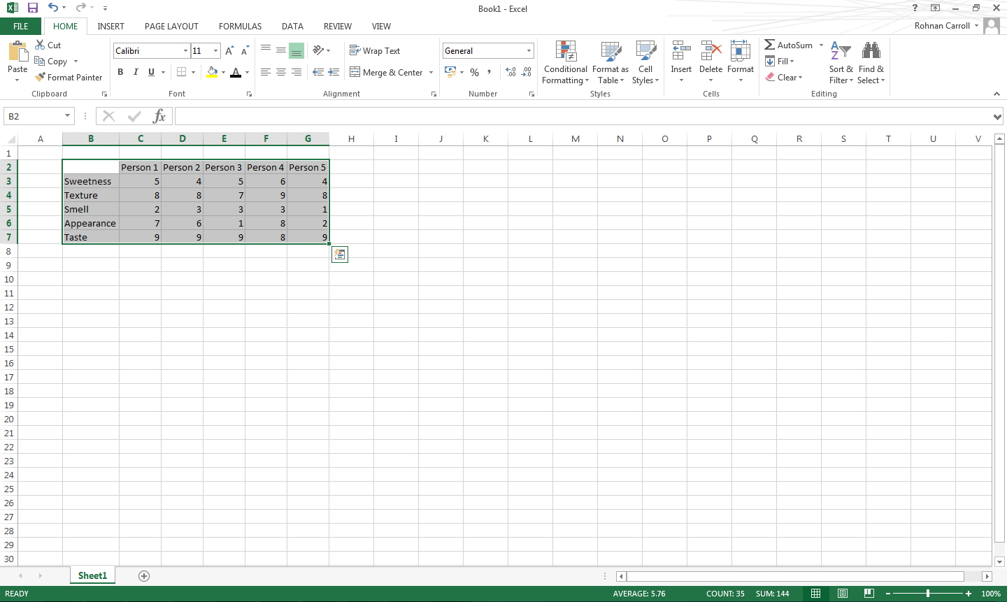
Then select the insert tab. You can then either select what chart you want to use or let Excel recommend a chart which will display your data.
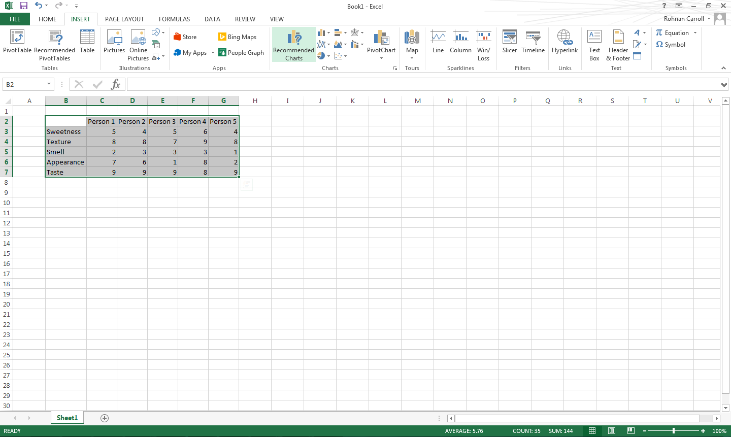
You can then go through the charts and select which one you want.
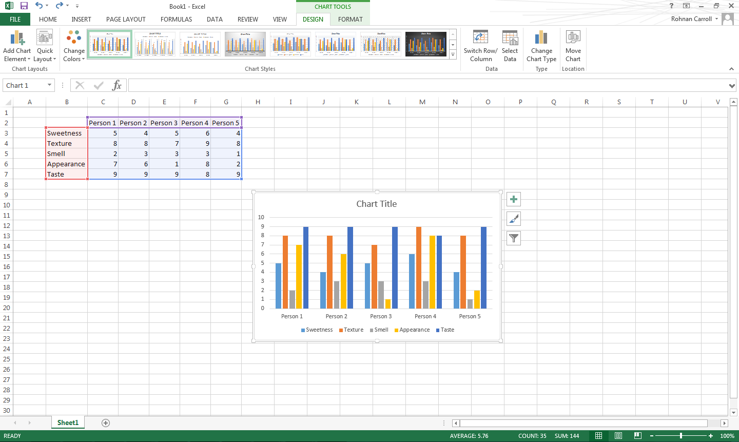
Once the chart has been inserted, you can add titles, axis labels and format it.
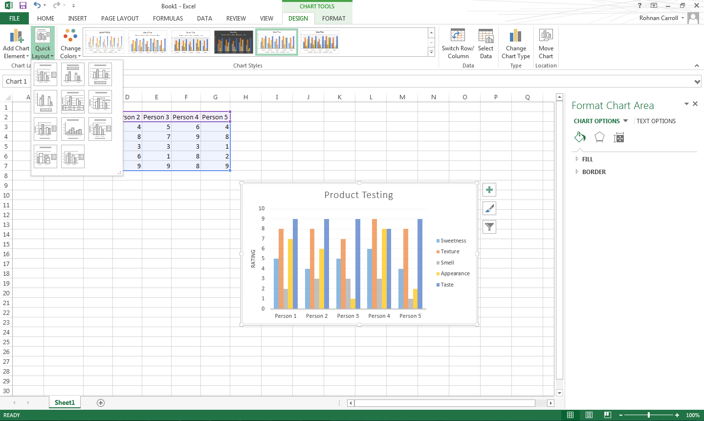
You can change the chart type under the design tab.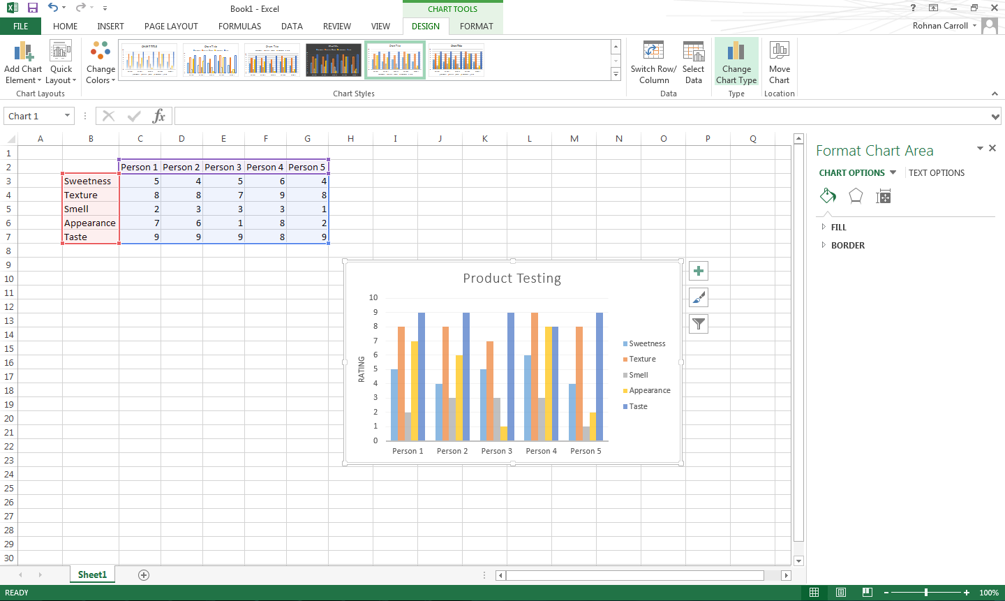
For this data a radar diagram is the best way of displaying it.