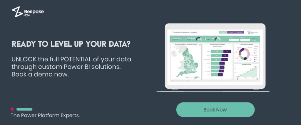
Hi guys my name is Julius, I’m a Power BI developer for Bespoke and so I’ll be showing you how you can connect your Dynamics 365 sales data to Power BI in order to default visualisations like this into something like this, which provides much greater room for customization and branding. As well as allowing you to drill down into the data trying to find the answers that you need. Let’s head on over to the new Power BI file and get data.
We’ll be connecting to our Dynamics data through the dataverse connector. But before you do this, please make sure that you have the tabular data stream protocol enabled in the Power Platform admin centre. The only other thing that we need is the environment domain or the environment URL, and this can be found in the Power Platform admin centre as well. But we’re going to get it from make.powerapps.com. So if you click on the cog up here and click on session details, copy and paste only this section of the instance URL. If you copy and paste the whole thing it will error when trying to connect.
Microsoft Dynamics integrated with Power BI
So Power BI is going to list the entities or tables within that database environment for us, including our Dynamics data. So as you can see here – the first table that appeared is the accounts. Our opportunities and our other tables are also in here, such as our quotes, our goals, our leads – it can all be brought into Power BI by just clicking here and taking it.
But for today we’re only going to bring in the accounts and the opportunities. We’re going to transform this data because there are a lot of columns within these tables and we only need a few of them, and it’s good to keep the data model as small as possible. So only include the columns that you need. This can be done by going up here and selecting choose columns. So for the opportunity table, I’m going to bring in the opportunity ID, when it was created, the name of the opportunity. To bring in the actual close date and the actual value I’m going to do the same with the estimated close date and estimated value. I’m going to bring in the step name as well, which is the stage in the pipeline that the opportunity is at, and the state code name which will tell us whether or not it’s won, open, closed etc. Then I’m also going to bring in the account id so that we can connect it to our accounts table. So let’s go ahead and do the same with the accounts table. So the account id so it can be linked, I’m going to bring in the industry name actually as well here and then the name of the account.
So we’re going to go ahead and load that into our data model. It’s also a good practice to rename those column headers, but I’m keeping it simple for now and just loading it in. What Power BI is going to do for us now, it’s going to bring it into the data model and then it’s going to try and detect a relationship between these tables, which is why we brought in the account id’s.
The relationship that we’re going to see in a second is probably not the relationship that you will see, because we’re using a sample data set provided by Microsoft. So if we go into here, we can see that Power BI has created a one-to-one relationship between these tables. In your case, this will probably be a one-to-many relationship, because a single account can be associated with multiple opportunities. But for us this is fine.
Power BI Analysis
So if you go in here we start creating some visualisations. So we can click on the chart type we want up here and then we can use the filters pane, the fields pane sorry, on the right hand side here and we can just tick what we want to see within this chart and Power BI will actually analyse this and do it for us. So as you can see, we see the actual value by the account name here.
Perhaps we want to see how the estimated value is split by industry – you can see that in a pie chart here. Or perhaps we want to see the estimated value at each stage in the pipeline – that’s where our step name comes in and then, sorry our estimated value. Now what we might want to do here is we might want to only see our open opportunities, that’s where our state code name comes in. So we can drag that here and then we can select open and then these are all of our open opportunities included here. Now we might want to also sort this y-axis out here, so we can go click on the ellipsis, go to sort by and sort by step name and then instead of having it three two one, you’d want it one two three, so we’ll change it to descending there. So as you can see after creating a few more visualisations and applying some branding and formatting, we’re not far off something like this. This can then be uploaded to the Power BI service and also embedded in your Dynamics app if you wish.
So that’s everything for this video, I hope you found it useful, thanks for watching and I’ll see you in the next video.