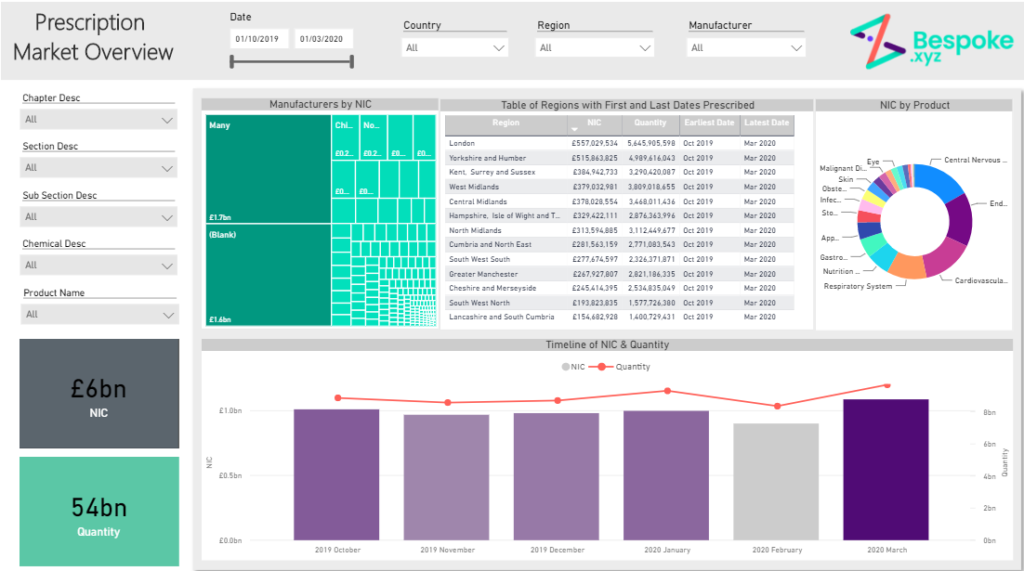
1. Ensure a clear layout that is easy to digest
Clear data visualisation is key, so pay attention to how users will read the dashboard (i.e. left to right). Make it easy for the user to understand; they should be able to take a quick look at any data visualisation and immediately understand what it is showing.
2. Keep it simple
Think about which data visualisations are best to show each piece of information. Sometimes a simple table may be better than a chart as it can contain much more information but still be easy to read. Other times it may be beneficial to have a visual representation of that data.
3. Interactions are important
Think about how the end users are going to be using the dashboard. What might they want to see more in-depth analysis on quickly and efficiently? Tooltips, Drill downs, Filtering and Highlighting are all key to BI development and allow the user to view further details without being overloaded with too much information at once.
4. Build strong data relationships
The relationships between the tables in your model determines how quick and efficient your dashboards are. Once you have a strong data structure it will be much easier to calculate and analyse things from it.
5. Key questions
Think about the typical questions the user would want to be answered by this dashboard. Does it answer all of those? If not, think about how adding a filter or tooltip or a new chart might benefit this. However, remember to keep it simple, try answer the most questions with as little visualisations as possible.
Bespoke specialise in Power BI consulting and provide a range of services to help with your Power BI development.
Get in touch for more info about how we can support you with the Power Platform technologies in your business.