Power BI just got a whole lot better! With its recent updates, Microsoft has rolled out some game-changing features that make data analysis and reporting even more powerful.
In this blog, we’ll take a closer look at some (there’s been a lot) of these features and how they can supercharge your Power BI capabilities.
Ready to see what’s new? Let’s dive in! …
Customising Reference Layers in Azure Maps Visual
One of the standout features in the new Power BI update is the ability to customise reference layers in Azure Maps visual.
Before, you were stuck with pre-defined layers, but now you can tweak these to fit your exact needs.
Want to overlay sales territories or demographic data? Go for it! Plus, you can now pull in GeoJSON data straight from CSV files – no more messy conversions.
You can also adjust colours and sizes directly in Power BI, and even make your maps dynamic based on user selections. This makes your maps not just functional, but also super interactive and tailored to tell your story.
DAX Query View in Live Connect
Another exciting addition to the Power BI update is the DAX Query View for live connections.
If you work with complex data models, this one’s revolutionary.
Now, you can see and troubleshoot DAX queries in real-time while connected to a live data source. Plus, you can now add or update multiple measures at once, thanks to the DEFINE syntax.
This means you can try out different formulas and quickly add them to your model with just a click – no more tedious clicking through each measure. Whether you’re optimising reports or fixing bugs, the DAX Query View makes the whole process smoother and way more efficient.
View Reports in OneDrive and SharePoint with Live Connected Semantic Models
Power BI has made it even easier to collaborate by allowing you to view reports with live connected data directly in OneDrive and SharePoint.
Previously limited to data in import mode, this integration now supports live connected semantic models, so you can access the most up-to-date information without leaving your familiar OneDrive and SharePoint environments. Share links to reports, collaborate in real-time, and take advantage of built-in version control – all within the tools you already use every day.
Storytelling in PowerPoint – Export to PowerPoint Dialog
Say goodbye to the hassle of losing interactive elements when exporting Power BI reports to PowerPoint. Now, you can effortlessly turn your data insights into stunning presentations without compromising on quality.
Whether you’re gearing up for a client pitch or an internal review, the enhanced “Export to PowerPoint” dialogue keeps your visuals sharp and interactive. It’s all about making your data tell the story you want, directly in PowerPoint, without extra steps or headaches.
Updates to the Enhanced Report Format (PBIR)
Managing and sharing reports just got a whole lot easier with the latest tweaks to the Enhanced Report Format (PBIR). The updates are all about making your reports quicker to create, more reliable to share, and better integrated with other Power BI tools.
Whether you’re prepping for a big client meeting or just sharing insights with your team, these improvements ensure your reports are more flexible and perform better across the board. It’s all about getting your data where it needs to be, faster and smoother than before.
Advanced Visualisations in Power BI
Power BI’s latest update is packed with some seriously impressive visuals that can make your data pop.
- Linear Gauge by Powerviz: easily track progress with customisable gauges. Whether it’s sales targets or project milestones, this visual helps you see where you stand at a glance.
- Drill Down Map PRO by ZoomCharts: turn your geographic data into interactive maps with dynamic layers and customisable features. Perfect for diving deep into regional performance.
- PowerGantt Chart by Nova Silva: get a clear view of your project timelines with flexible features like milestone tracking and hierarchy management.
- Icon Map Pro: allows you to seamlessly visualise complex geospatial data, making those location-based insights jump right out of your dashboards.
These visuals not only look great – they make your data work harder for you, giving you the insights you need with just a few clicks. Whether you’re tracking performance, analysing geography, or managing projects, these tools make your reports more engaging and effective.
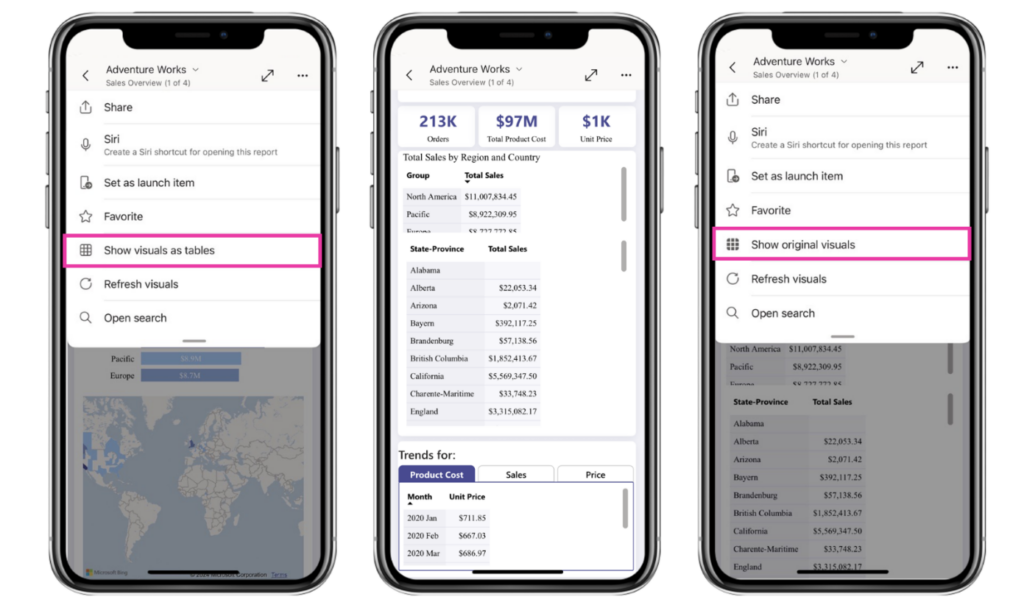
Show Visuals as Tables on Mobile
Power BI is making its mobile app even more user-friendly with the new “Show Visuals as Tables” feature.
Now, you can quickly view all the visuals in your report as tables, which is especially handy for those who rely on screen readers or prefer to see data in a tabular format—like viewing it in Excel.
Just tap the new option in the report header to switch views. It’s all about making your data more accessible and easier to understand, wherever you are.
Getting Started With Power BI
Power BI keeps getting better, and these latest updates are no exception. With new tools like customisable reference layers, advanced DAX Query View, and improved export options, you can create even more dynamic and insightful reports. But this is just a taste – here’s a full list of Power BI updates and what they can do for your business.
Power BI is all about turning your data into actionable insights, making it easier to visualise, analyse, and share information.
If you want to dive deeper into what Power BI can do for you, get in touch with us today. We’re here to help you make the most of your data!