Get a callback from our team within 20 minutes during business hours.

A Power BI dashboard is a single page that tells a visual story of your data. Dashboards are an interactive way to measure and monitor important metrics in your business. A secure, cloud-based platform allows you to create and view your data through these visual dashboards at the touch of just a button.
Speak to a Power BI Dashboard Expert to discover how you can transform data into actionable insights, make informed decisions, and drive business success.

"*" indicates required fields
Every business has data. But turning that data into something useful? That’s where we come in.
Our team designs and builds bespoke Power BI dashboards that are shaped around the way you work. Whether you’re tracking performance, forecasting revenue, or managing operations, we make sure the data you need is always at your fingertips – and easy to understand.
We don’t believe in one-size-fits-all templates. Every dashboard is developed in close collaboration with your team to reflect your priorities, your metrics, and your goals. Fully integrated. Fully scalable. And built to help you make smarter decisions, faster.

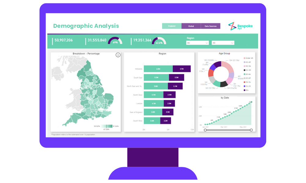
Explore some of the other dashboard examples we’ve created to demonstrate the power of having high-quality data to use across your organisation.


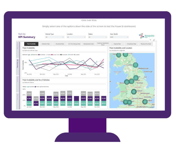
Imagine being able to track fleet availability, utilisation, downtime, and on-time delivery rates in one place – updated in real time and easy to explore. Our interactive Power BI dashboard shows how plant hire businesses can turn complex datasets into clear, actionable insight.
Click through to test it with sample data, explore the filters, and see for yourself how the right dashboards make decision-making faster, easier, and more accurate.
Take a look at the dashboard here
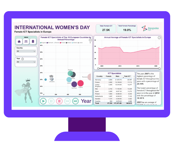
Our International Women’s Day dashboard demonstrates some key stats around the change in the percentage of females in ICT roles throughout Europe over time. The report looks at the number of ICT specialists across Europe, pulling data from Eurostat which contains the number of female and male ICT Specialists between 2004-2021.
Take a look at the dashboard here

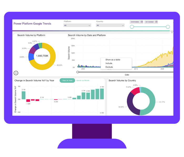
Our World Statistics Day Power BI dashboard showcases the Power Platform Google search trends from 2004 to now, across the US, UK, Germany & Denmark. Although Power BI has dominated over the years, you’ll see that Power Automate search terms are on the rise.
Take a look at the dashboard here
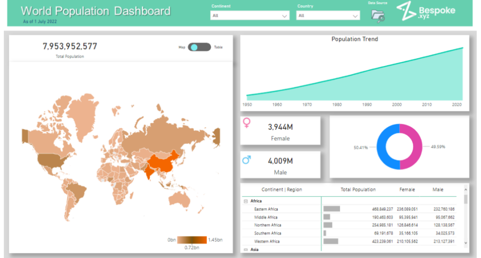
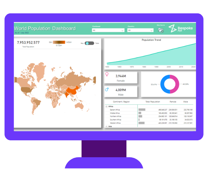
The World Population dashboard development allows you to interrogate world population data – breaking it down by continent and country, male & female split, and how the population trend is changing over time. Discover more insights on specific country by using the hover-over drill throughs on the world map. A perfect example of how Power BI allows you to do so much more with data.
Take a look at the dashboard here
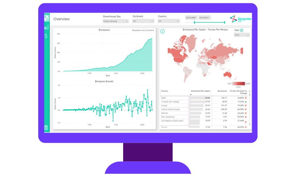
With global greenhouse gas emissions rising and the UN calling for dramatic systematic change, we decided to bring all the scattered data into one place. This dashboard provides insight about the global impact of three major greenhouse gases, which countries have lowered their emissions the most in the last 10 years and which industries are responsible for emitting the most gases.
Take a look at the dashboard here
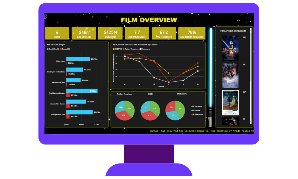
You can never have too much data… even data on some of your favourite films. This interactive Power BI dashboard will provide data on which films had the biggest budgets, critics’ approval winners, facts about your most-loved characters and even which starships had the biggest hyperdrive (and crew).
Take a look at the dashboard here
This is a perfect example of how Power BI comes into its own for certain topical things, in this case it was the Covid dashboard. This easy-to-view Power BI dashboard development provides a top-down view of most vaccinated areas in the UK alongside additional filters enabling you to check the progress of vaccinations in your local area. It is also capable of comparing the UK’s progress with the rest of the world.
Take a look at the dashboard here
Building a dashboard is easy and can be done in 4 simple steps. It is a simple and effective way to bring data together to gain insight into key areas of your business and where developments can be made.
Some examples of where you can use them in your business include:
So what is the difference between a Power BI dashboard vs a report? A dashboard is a single page consisting of key information collected and combined across different reports and their datasets and facts.
A Power BI report, on the other hand, is a set of multiple pages combining different datasets that represent different findings and insights, and different pages are available to view the report data.


As you can see, Power BI dashboard development can be used across various organisations and sectors. We know that in todays world, healthcare organisations are producing and storing more data than ever before.
Through creating Power BI dashboard examples, we have identified how it can help sales teams, physicians, executives, administrators, and others to make sense of the mountain of data available to them.