Get a callback from our team within 20 minutes during business hours.
To those less in-the-know, data can easily come off as being quite a dry subject. Numbers? Graphs? Comparisons? Without the tools to understand or manage data’s complexities, it can all seem a little overwhelming.
But when you have the power to unlock the stories data tells, it opens up a whole door of exciting narratives and intriguing discoveries. And the data can be about anything – from your favourite TV show to how you like to organise your spending.
Here at Bespoke, we’ve been having some fun with data lately. Take a look at the three Power BI dashboard examples below created with Microsoft Power BI, which share some pretty thrilling insights…

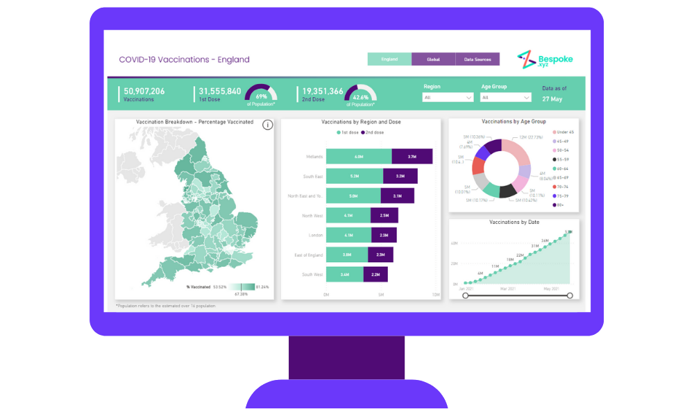
We’re sure you’ll agree that everyone is keeping a close eye on the UK’s covid-19 vaccination rollout right now. We decided to compile all the current stats on vaccinations in this easy-to-view Power BI dashboard, so you can stay close to the action as it unfolds.
The map on the left gives a top-down view of the most vaccinated areas in the UK, while the filters in the top right enable you to check the progress of vaccinations in your local area and by age.
Flip on over to the second page and we can compare the UK’s progress with the rest of the world, checking out the most vaccinated countries and seeing the number of vaccination doses administered so far.

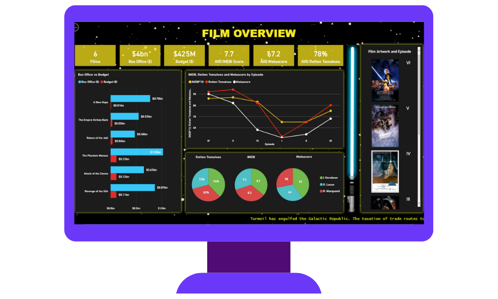
To celebrate May 4th, we decided to delve deep into the minutae of our favourite film saga, Star Wars.
Whether or not you’re a fan of the multi-million dollar franchise, few can deny its monumental success that spans several movies, comic books and video games, and brought us characters and adventures we’ll never forget. One might say there’s only one way to handle so much data…and that’s of course with a Power BI dashboard.
Did you know that out of the first six Star Wars films, the Phantom Menace received the highest box office takings, but has the poorest ratings?
Or that C-3PO, Obi-Wan Kenobi and R2-D2 were the only characters to appear in every one of the first six films?
Explore our interactive dashboard to learn which films had the biggest budgets, which ones won the critics’ approval, and even which starships had the biggest hyperdrive (and crew). Learn fascinating facts about your favourite characters – from Boba Fett’s birth year to Chewbacca’s eye colour. It’s all in there.

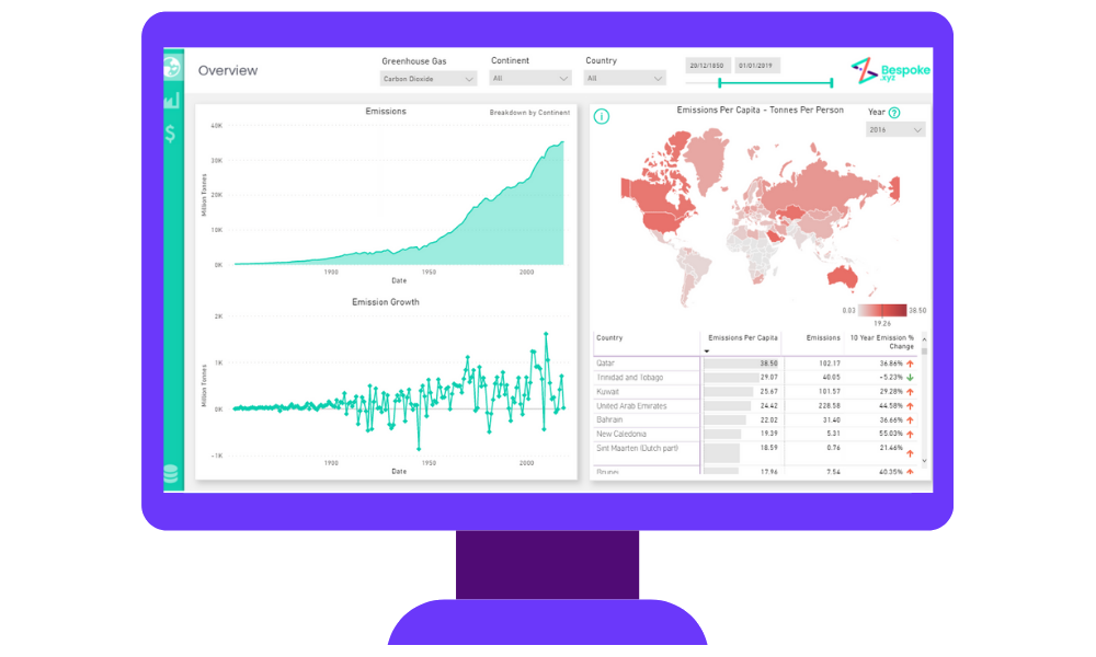
Climate change is a pressing topic at the moment, and rightly so. With global greenhouse gas emissions rising at a worrying rate since the start of the industrial era, and the UN calling for dramatic systematic change, we reckoned there was only one thing to do with all of the scattered data out there – bring it all into one place.
Our GHG emissions data dashboard takes a look at the global impact of three major greenhouse gases: carbon dioxide, methane and nitrous oxide. See which countries have lowered their emissions the most in the last 10 years; which industries are responsible for emitting the most gases, and how the correlation between GDP and emissions has changed over the years – and still continues to change.
This dashboard is full of amazing insights, all of which help us to gain a much-needed clearer picture on the climate crisis.
Hopefully you’ll know by now that data isn’t just a bunch of numbers or observations. Data is a powerful storytelling tool we can use to reveal incredible things about the lives we lead and the world we’re a part of. We can use it to stay informed about important issues, make impactful decisions…and maybe even have a little fun too.
Are you ready to get playful with your data? Get in touch with our team of experts who can help you find new ways to unlock stories about your business.